提示词库
AI 提示词库
汇集全球创作者的精选图像、视频与建站提示词。复制任意一条,替换主体或风格,即可用最新模型生成。
15,630 条提示词 · 每日更新 · 完全免费
共 606 条
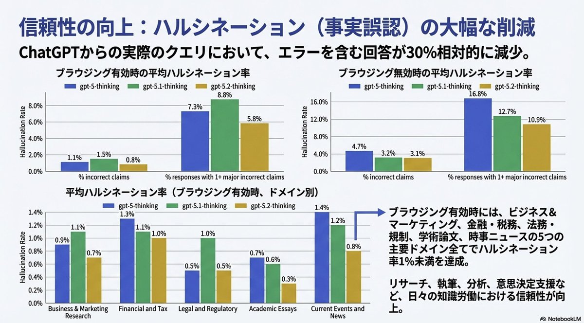
Convert Image to Editable PPTX with Object Separation Prompt
From this image, please create a pptx file where all text is editable and all objects are movable.
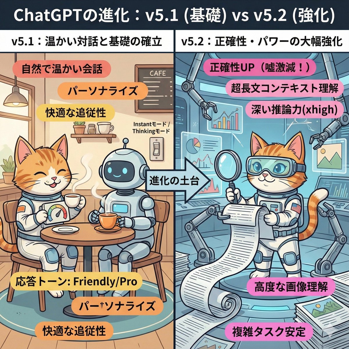
ChatGPT v5.1 vs v5.2 Evolution Infographic Prompt
A cute and playful, comical manga-style infographic illustration. A comparison diagram split into left and right halves, with a large title at the top reading: "Evolution of ChatGPT: v5.1 (Foundation) vs v5.2 (Enhancement)." The left half is titled "v5.1: Warm Dialogue and Foundation Establishment." The background is a cozy, organized cafe-like room. The character (or person) from the uploaded reference image is depicted here, smiling relaxedly and naturally enjoying a conversation while drinking steaming tea with a friendly, round robot. They have a custom dial labeled "Response Tone: Friendly/Pro." Warm-colored keywords float around: "Natural and warm conversation," "Personalization," "Comfortable follow-up." In the center, an arrow labeled "Foundation of Evolution" indicates that the right side is based on the left side. The right half is titled "v5.2: Significant Enhancement of Accuracy and Power." It is an expanded, futuristic, massive high-tech research lab built upon the foundation of the room on the left. The same character (or person) from the reference image is depicted here with a confident expression, wearing high-tech analysis goggles. They are spreading out a gigantic scroll (long document), accurately scanning complex graphs and images floating in the air, and working intensely with multiple mechanical arms. Powerful, vivid keywords float around: "Accuracy UP (Lies drastically reduced!)," "Ultra-long context understanding," "Deep reasoning power (xhigh)," "Advanced image comprehension." Overall, the contrast between the left side, representing comfortable daily life, and the right side, representing reliable professional power, is expressed cutely.
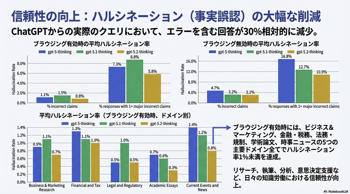
Convert Image to Editable PowerPoint Slide Prompt
Completely reproduce the attached image as a single slide in a pptx file. Make the text fully editable, and crop and use the diagrams and graphs from the original image as they are.
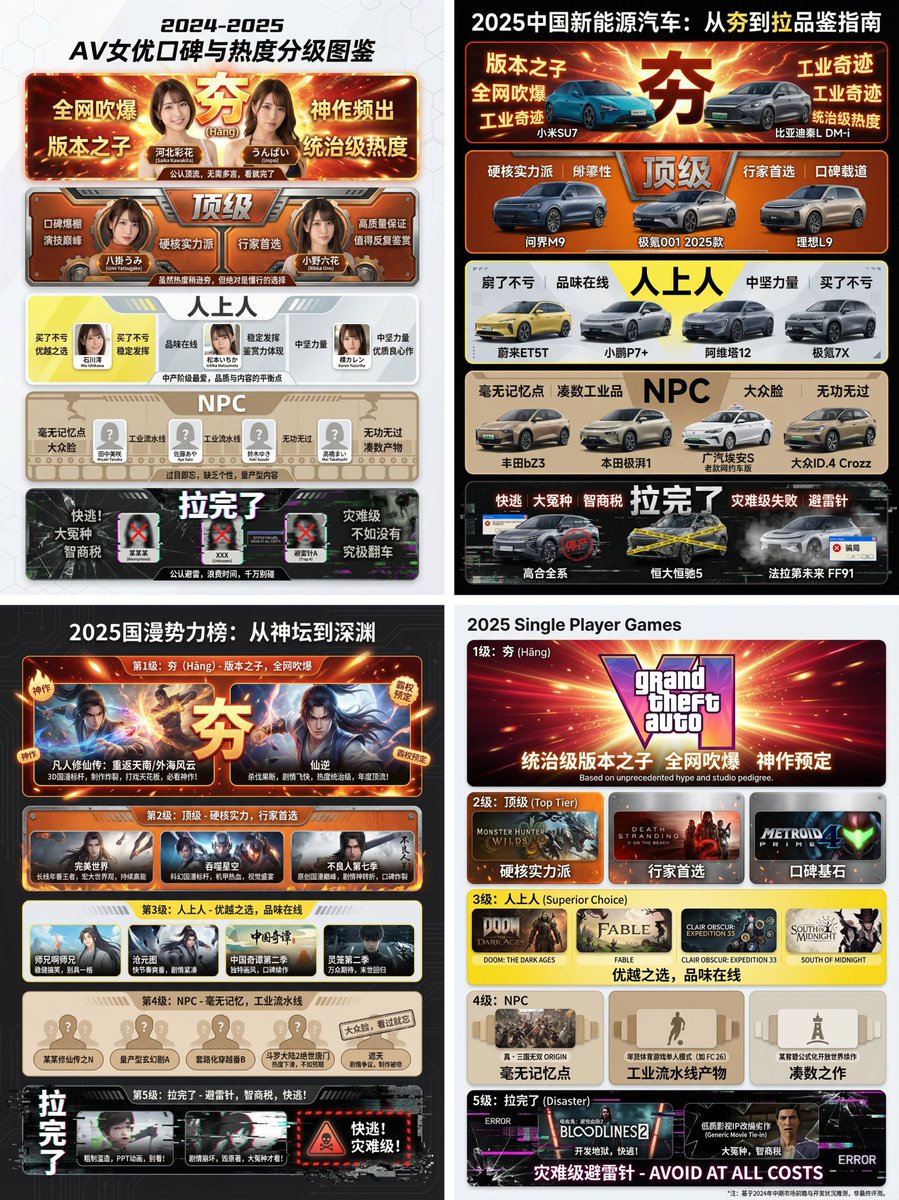
Hāng to Lā (Good to Bad) Rating Infographic Prompt
[Core Task Instruction] You are an AI expert with real-time web search capabilities and top-tier data visualization design skills. Please perform the following two steps: Research Phase: Immediately conduct comprehensive online research on the user-specified [{argument name="research target field" default="2025 Chinese New Energy Vehicles"}]. Collect public reputation, market popularity, professional reviews, and user feedback data on different sub-products, models, or works within this field. Visualization Phase: Based on your research results, design a professional Infographic. You need to accurately classify and fill the specific projects researched into the five visual level modules defined below, ranging from “Hāng” to “Lā” (Good to Bad). [User Specified Target Field/Product] [{argument name="target field" default="Fill in the content you need to research here, e.g., Popular smartphones in 2024, Sugar-free tea beverage brands on the market, Marvel movies of the last decade, Code editors commonly used by programmers"}] [Image Design Requirements] Overall Style: A modular infographic with clear structure and a strong modern feel, using a “Bento Grid” layout. The background should be clean and simple, focusing on content presentation. Visually, it must show a strong hierarchical drop-off from high to low. Level Structure and Visual Definition (Strictly enforce the following five levels): Level 1 (Highest Level): 夯 (Hāng - Top Tier) Research Filling Standard: According to research, the generally recognized “Version King” in the field, with dominant popularity and undisputed top-tier products/works. Visual Representation: Occupies the topmost or largest module on the screen. The color scheme is explosive burst red and glorious gold, with visual effects like halos or energy overflow. The font is the largest and boldest. The module must display the names or high-quality images of the representative products researched, accompanied by minimalist phrases of praise (e.g., “Blown up across the internet,” “Masterpiece”). Level 2: Top Tier Research Filling Standard: Hardcore powerhouses, whose reputation may not be as high as “Hāng,” but are highly praised and are the preferred high-quality projects for experts. Visual Representation: Located on the second layer. The color scheme is solid, high-end burning orange and metallic silver. The module design appears robust and textured. Display representative powerhouse products. Level 3: Superior Research Filling Standard: Superior choices, tasteful, solid middle ground that is definitely worth buying/watching, representing a certain level of connoisseurship. Visual Representation: Located in the middle layer. The color scheme is bright, clean lemon yellow and cool gray. The design style is modern and refreshing. Display representative high-quality middle-class products. Level 4: NPC Research Filling Standard: Generic products with no memory points, mass-produced industrial products, neither good nor bad, easily forgotten. Must include specific product or brand names, do not be vague. Visual Representation: Located in the lower-middle layer. The color scheme is dull and bland bread color/beige or cardboard brown. The module design appears ordinary, repetitive, and lacks personality. Display those very mediocre products. Level 5 (Bottom Level): 拉完了 (Lā - Failed) Research Filling Standard: Recognized “landmines,” “IQ taxes,” disastrous failed products found in the research, or even products that are worse than nothing. Must include specific product or brand names, do not be vague. Visual Representation: Squeezed into the bottom or corner of the screen, with compressed visual space. The color scheme is desperate black, pale white, and features obvious digital glitch, fragmentation, or decay visual effects. Display those famous “flop” products, accompanied by warning phrases (e.g., “Run away,” “Big sucker”).
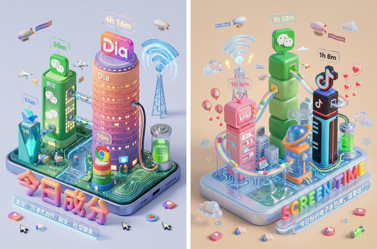
Screen Time Digital Town Visualization Prompt
Please read the user-uploaded [Screen Time Data Screenshot] and identify the top four APP names and icons. Retrieve information and icon styles for these APPs. Based on the tone of the APP combination (Social/Entertainment/Office/Comprehensive), independently decide on the core art style. [2. Main Model Construction: Miniature Town Infrastructure] Construct a vibrant miniature digital town in the center of the screen, not just a display of buildings: Smart Base (Foundation): A stylized mobile phone base. The surface is no longer flat but topographical (depending on the style, it could be rolling circuit board hills, glass water surfaces, or Lego baseplates). Building Cluster (APP Embodiment): Skyscrapers representing the APPs. Base: A cartoon-style smartphone base with rounded, frosted metal edges, and the screen surface emits a faint breathing light. The base is surrounded by floating, materialized 3D Emojis (clouds, stars, hearts) with a translucent jelly texture. Building Cluster (APP Embodiment): Q-version skyscrapers stand on the island, representing the identified APPs. Height Rule: Building height strictly corresponds to usage duration. The APP with the longest usage time is the tallest skyscraper, occupying the visual center. Shape Rule: Extract the geometric features of the APP icons (e.g., circular icons become stacked spherical towers, square icons become rounded cube buildings). Material: A mix of high-grade Frosted Polymer Clay and Translucent Jelly Resin. The surface should have delicate fingerprint textures and diffuse reflection gloss, like an expensive blind box toy. Top Logo: The 3D logo of the App stands on the rooftop, with a texture like freshly baked, glossy candy. Floating Time Card: A frosted glass-textured 3D bubble floats directly above the Logo. The bubble encapsulates three-dimensional, softly glowing numbers (corresponding to usage duration, such as "{argument name="usage duration" default="4h 12m"}"). Buildings should not be arranged in isolation but should form neighborhoods. Tall buildings are in the center (CBD area), surrounded by potentially low-rise system application buildings (Settings, Calendar, etc.). [3. Urban Ecosystem and Interaction System (Urban Ecosystem & Interactions)] (Core Upgrade: Add “Interaction” and “Liveliness”) Please add rich dynamic details between the buildings to show how this “Digital Town” operates: Traffic and Connection (The Data Flow): Connection Method: Buildings must have physical connections. Style Adaptation: If it's cyberpunk, use glowing fiber optic elevated bridges and maglev trains; if minimalist, use transparent glass pipes; if cute, use rainbow slides. Vehicles and Transport: Pipes or roads must have flowing light points/capsules, representing data transmission. Active “Data Sprites” (The Digital Citizens): NPC Setting: Add tiny functional NPCs besides the main character figure. Message Carriers: Near social APP buildings (like WeChat), flying paper airplane drones or small postmen carrying envelopes move in and out. Like Sprites: Around video/community APP buildings (like Douyin/Xiaohongshu), glowing red hearts or thumb balloons float like fireflies. Delivery/Shopping Riders: If Meituan/Taobao is present, there should be miniature riders or package conveyor belts connected to the main building where the protagonist is located. Public Infrastructure (Public Utilities): Wi-Fi Signal Tower: A glowing signal tower (shaped like a Wi-Fi icon) stands high in the town, broadcasting energy ripples across the city. Battery Energy Station: A cylindrical energy tank (shaped like a battery icon) is located at the edge of the town, connected by thick cables to power the main building, where green liquid energy can even be seen sloshing. Notification Airship: Small airships or clouds float in the air, hanging banners with “New Message” or “Red Dot.” [4. Bottom Visual Center: Stylized 3D Nameplate] (Keep unchanged, emphasize high-end design sense) Main Title Design: “SCREEN TIME” or “{argument name="main title" default="Today's Composition"}” are designed using Inflatable Typography or Neon Tube Fonts, with materials related to the current theme. They are not printed on paper but physically “stand” in the foreground of the image. Decorative Details: Small 3D fragment elements (such as play buttons, like thumbs, battery icons) are scattered around the title, increasing the richness and trendy feel of the image. Subtitle Copy: Below the 3D title, generate a floating glowing light strip with a short, sharp comment based on user data. [5. Rendering and Photography (Tech Specs)] Composition: Axonometric overhead view, emphasizing prosperity and order. Details: Extremely rich Micro-details, making the viewer want to zoom in to see what the small figures are doing in every corner. Keywords: Octane Render, C4D, Isometric City, Micro World, Living Ecosystem, 8k Resolution.
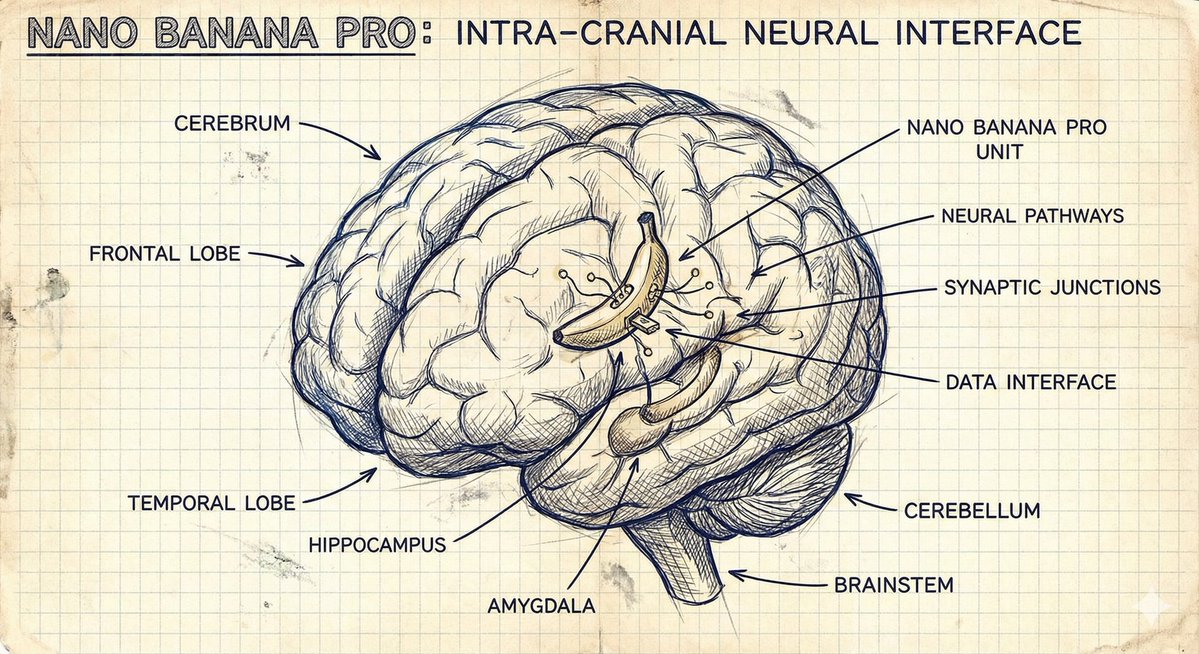
Hand-Drawn Isometric Schematic Diagram Prompt
Nano Banana Pro, Create a hand drawn isometric schematic diagram of {argument name="Object or Concept" default="the principle of aircraft takeoff"}

Infographic Generation for Old-Fashioned Donuts with Character Skill Variation
Create an image showing the steps for basic old-fashioned donuts being performed by the character in the reference photo, and turn it into an infographic. The character should be a cooking beginner, struggling through the process. No dialogue is needed. Display detailed explanations for each step. Aspect ratio 2:1 Three-part structure: Title, Ingredients, Steps Title: How to Make Basic Old-Fashioned Donuts Display ingredients and quantities with illustrations Manga-style process flow Prompt (Expert Cook Version): The character should be an expert cook, easily progressing through the steps.
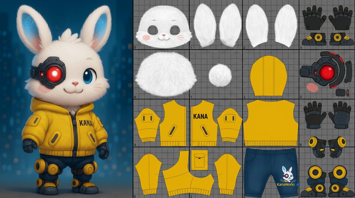
Prompt for UV Unwrapping a 3D Model
unwrap the UVs of the 3D model shown in the image. About one-third of the image should be a reference view displaying the 3D model itself.The remaining area should include the UV layout for the head, body, and limbs.Unwrap the surface of the 3D model and flatten it into a single 0–1 two-dimensional UV space.
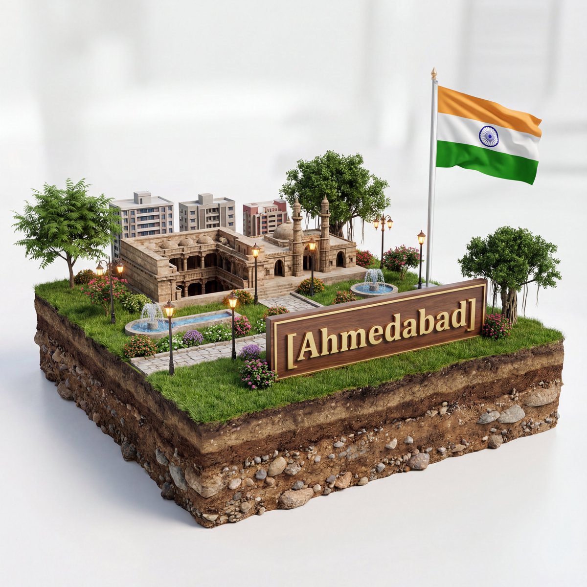
3D Diorama of Ahmedabad Landmark
Create a hyper-realistic 3D diorama-style model of [{argument name="city" default="Ahmedabad"}]. The model should appear as a miniature, set on a raised cross-section of earth that reveals soil and rock layers beneath a lush grassy surface. The structure must be highly detailed and proportionally accurate, surrounded by tiny realistic elements like region-appropriate street lamps, native trees, shrubs, water features like small fountains, and historically or culturally fitting pathways. The scene should evoke the unique character of [{argument name="city" default="Ahmedabad"}]’s surrounding landscape. The environment must include a soft white background to draw full attention to the model. Include the text “[{argument name="city" default="Ahmedabad"}]” in large, bold, elegant lettering prominently displayed on a big sign or billboard at the front of the diorama, easily readable and eye-catching, along with a large national flag on a tall, prominent flagpole positioned beside [{argument name="city" default="Ahmedabad"}], clearly visible and waving. 1080x1080 dimension
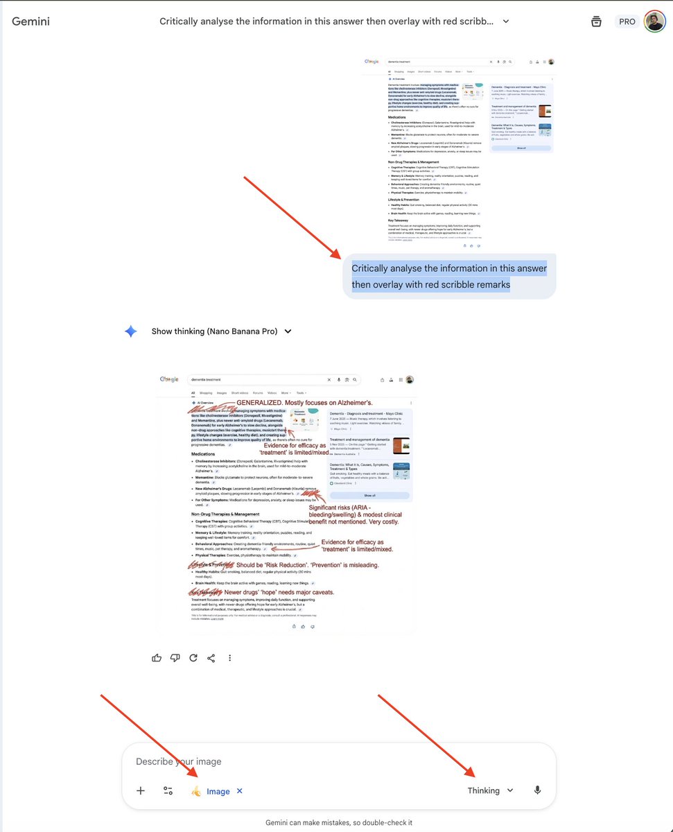
AI Overview Critical Analysis Prompt
Critically analyse the information in this answer then overlay with red scribble remarks
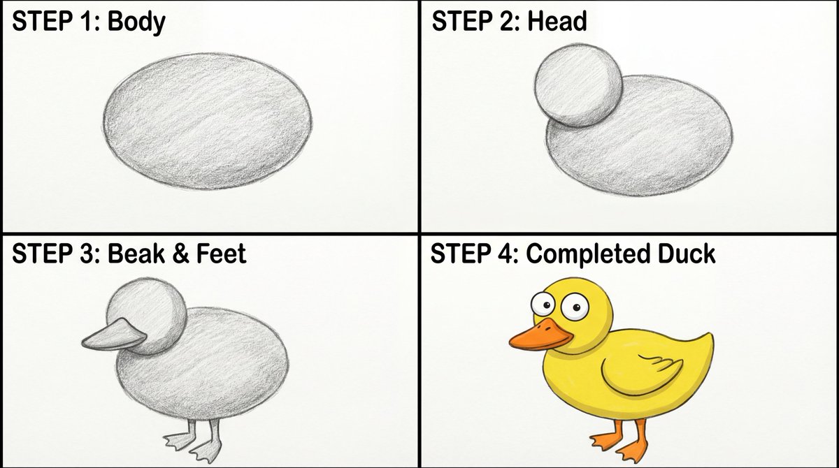
Four-Panel Guide for Drawing a Cartoon Duck
Create a four-panel, square layout guide for drawing a simple cartoon duck. 1. Panel one displays a grayscale oval for the duck's body. 2. Panel two shows a grayscale smaller circle overlapping the front of the oval for the head. 3. In panel three, a grayscale beak is added to the head, and webbed feet are attached to the bottom of the body. 4. The final panel reveals the completed duck with color now with two eyes on the head, and a wing outline on the body.
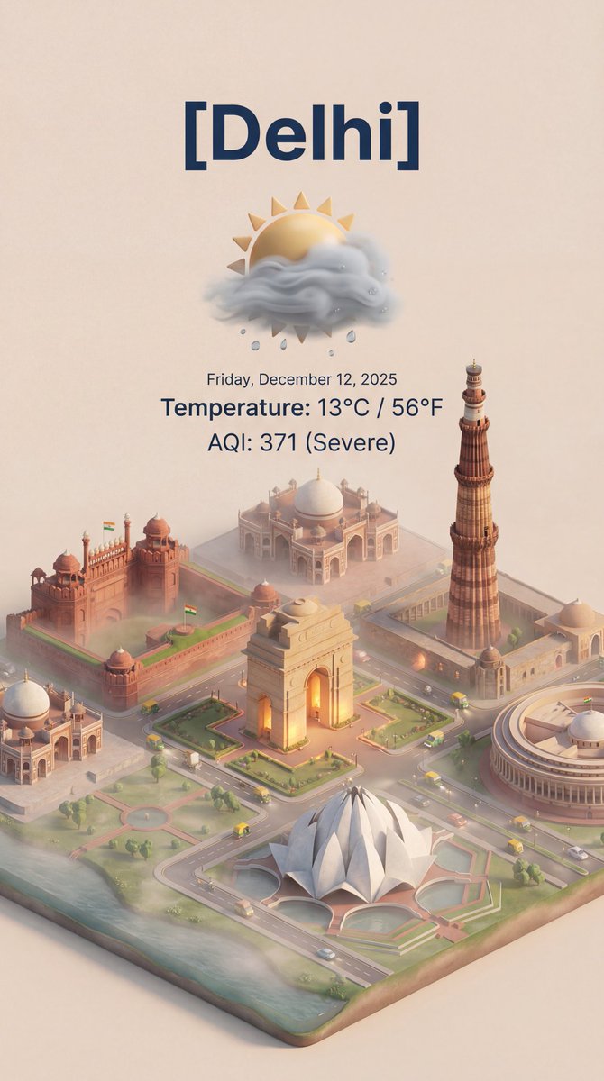
Isometric 3D Cartoon Scene of a City
create this isometric miniature 3D cartoon scene of [ {argument name="city name" default="Delhi"} ] including AQI and Temperature.
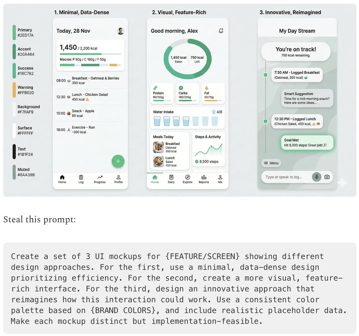
Five High-Efficiency Nano Banana Pro Prompts for Business Graphics
- {argument name="use case 1" default="LinkedIn Infographic"} - {argument name="use case 2" default="Technical Architecture Diagram"} - {argument name="use case 3" default="Product UI Comparison Model"} - {argument name="use case 4" default="Data Visualization"} - {argument name="use case 5" default="Code Visualization Explanation"}
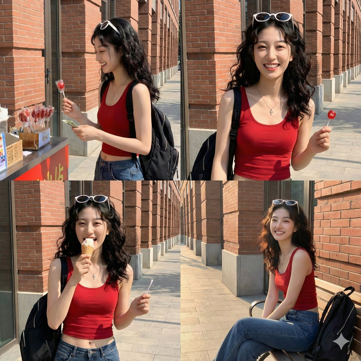
Time Progression Image Generation Prompt
Please display the effect for {argument name="time point 1" default="5 minutes ago"}/{argument name="time point 2" default="30 minutes later"}/{argument name="time point 3" default="1 hour later"}/{argument name="time point 4" default="2 hours later"} respectively
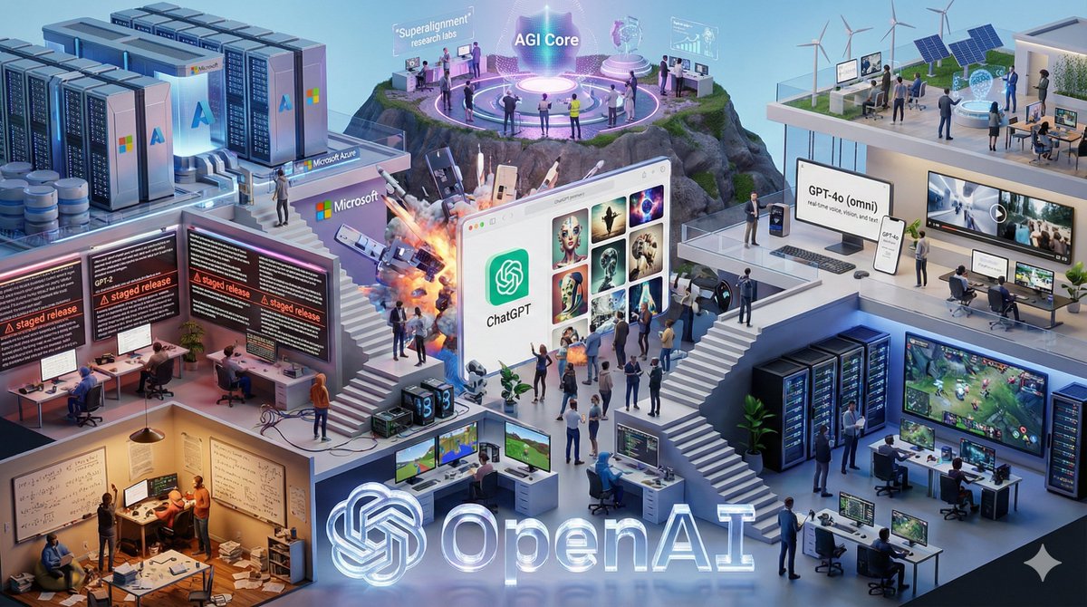
Isometric Vertical Timeline Prompt (Garage to Futuristic Peak)
From a humble garage to a futuristic peak — a frameless isometric world that tells an entire company’s evolution in one vertical timeline 🚀🏗️
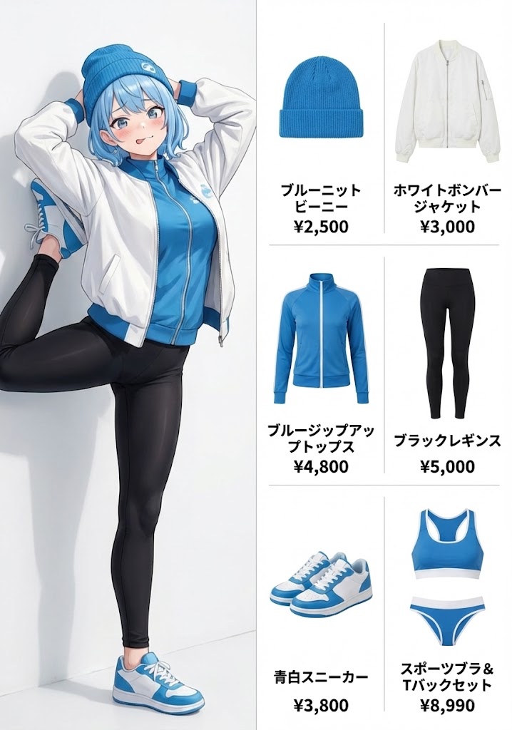
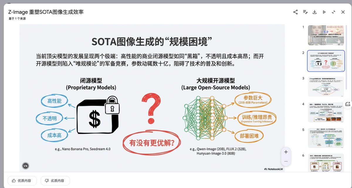
Presentation Slide Generation Prompt
Create a set of presentation slides, adopting a whiteboard and doodle style, focusing on step-by-step explanations, featuring a consistent colored thick pencil hand-drawn style, rich information, including Chinese text, using the nano_banana tool to generate images, and extracting core information.
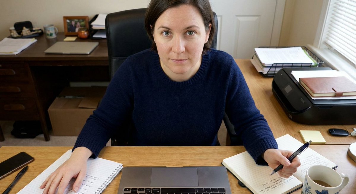
Forcing Left-Handed Writing
A person is facing the camera, sitting at a desk, with both hands positioned on either side of the frame. Important: the hand on the right side of the frame is holding a pen.
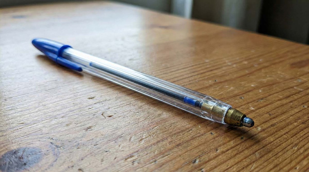
Microscopic Pencil Tip to Proton Zoom
Imagine a pencil tip seen through a microscope. Imagine how the pencil tip would look and create an image.

Informative Page Generation Prompt (Professor Hello Kitty)
generate image of the instructions about it so we understand it one page informative teach us .. make it professor hello kitty teaching
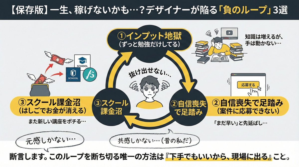
Infographic/Diagram Generation Prompt for Nano Banana Pro
"Conditions to include in the diagram: ・Top 3 reasons why designers fail ① Always studying ② Lacking confidence to apply for projects ③ Spending too much money hopping between schools Create an image for an X post based on these conditions"

Modern Minimalist PPT/Diagram Generation Prompt
1. Overall Visual Style Style Keywords: Flat UI, Vector, Modern Minimalist, Card-style design. Lines and Shapes: Rounded Corners Priority: All borders, background blocks, buttons, and process nodes must be rounded rectangles (Rounded Rectangles, with a large corner radius, approximately 10-15px). Elbow Lines: Process connections use right-angle polylines (no curves), lines are simple and strong. Color Logic (Key): “Candy Color” Scheme: Use light backgrounds with high brightness and low saturation (such as light blue, light green, light purple), paired with darker borders of the same color family. Border Emphasis: All graphics must have clear 2px~3px solid borders. 2. Vertical Layout Structure Regardless of the topic, please follow the following top-down layout order, which must be contained within a large border container: Layer 1: Main Title (Header) Position: Centered at the top of the container. Style: Bold black font, largest font size, darkest color. Layer 2: Core Flowchart Area Position: Occupies 50% of the core area of the layout. Content: Rectangular nodes + arrow connections. If it is a loop step, please use a dashed line pointing back. Layer 3: Feature List Position: Below the flowchart, centered or left-aligned. Style: Short and concise bullet points, slightly smaller font, with some white space. Layer 4: Full-width Summary Box (Footer Box) Position: At the very bottom of the container, filling the width horizontally. Color Scheme: Use a contrasting color (such as purple in the example), distinct from the main color scheme above. Function: Used to place 'Summary', 'Analogy', or 'Core Conclusion'. Landscape size (horizontal/scenic mode) is chosen because: Content Adaptation: Horizontal content like timelines is better displayed in a horizontal canvas to show the evolution process. Presentation Friendly: The 3:2 horizontal ratio is very suitable for insertion into PPTs and documents, and displays well on projectors or screens. Information Capacity: Horizontal layout can accommodate more text and icons, avoiding clutter.

Professional Infographic Generation Prompt
Based on the following topic [{argument name="topic" default="Map of Specialty Coffee Origins and Flavors"}], create a professional knowledge infographic. Requirements: 1) Extract 3-5 core knowledge points; 2) Use elements such as icons, flowcharts, and data visualization; 3) Information hierarchy must be clear, and visual guidance must be smooth; 4) Must include accurate Chinese title and explanatory text; 5) Color scheme must be professional and coordinated, suitable for business presentations. Layout should adopt a modern flat design style, 4K resolution, suitable for printing and sharing.
部分提示词收录自 X 平台创作者,版权归原作者所有。